Continuing My Current Obsession With John R. Neill
Posted 5 November 2008 in Books by Catriona
(On another note, I took all of these photos from the same book, so I have no idea how they turned out to be such radically different colours. Odd.)
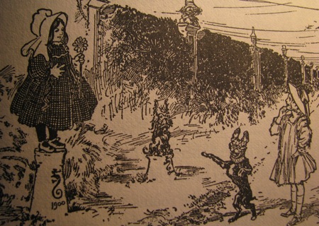
Partway through The Road to Oz, Dorothy—on her third visit to Oz—arrives at the castle of her old friend Nick Chopper, the Tin Woodman, Emperor of the Winkies.
She comes face to face with tin statues of herself and her companions on her original journey to Oz.
And John R. Neill comes face to face with his predecessor, W. W. Denslow:

After all, as Baum says, the statue was “life-size and showed her in her sunbonnet with her basket on her arm, just as she had first appeared in the Land of Oz” (The Road to Oz, Rand McNally, n.d. 162), and it was Denslow who decided how Dorothy first appeared.
It’s so charming, this illustration—despite the fact that Toto appears to be a psychopathic chihuahua in this instance. But the homage to Denslow; the sharp clash between the original illustrator’s heavily stylised and blocky work and Neill’s Art Nouveau magazine style; the shift from the turn-of-the-century Dorothy, more Victorian than twentieth-century child, to the smartly dressed 1909 girl, still fin de siecle but leaving Victorian restrictions behind—all these draw the reader into the illustration, giving depth and complexity to a world that was really only starting to leave its mark on the broader culture.
And, of course, it leaves Neill free to explore his own ideas about the fluidity and excess that can be brought to Oz illustrations, as in the elaborate furniture and the swirling draperies of Polychrome, the Rainbow’s Daughter, in this illustration (167):

Or how to put his own stamp on recognisable characters, as in this illustration of Dorothy greeting the Cowardly Lion (183):

For the modern reader, I suspect that Judy Garland is a more pervasive image in the mind’s eye than Denslow’s Dorothy. But in 1909, Neill seems to have recognised that he needed the two images to co-exist in the reader’s mind—even if one was tin and one was flesh.

Share your thoughts [2]
1
Matthew Smith wrote at Nov 5, 06:02 am
Wow! These are great. (Sorry if this comment is not really adding anything to the conversation but on the other hand silence can be misinterpreted as disinterest)
2
Catriona wrote at Nov 5, 01:34 pm
True—and anything is better than disinterest.
(On the other hand, if this comment doesn’t make sense, put it down to nine hours—or some such—of celebrating Barack Obama’s victory.)
I’ve become increasingly fascinated over the course of the Ph.D. with how text and illustration work together to create meaning. Nothing new in that, of course, but it’s not something that you generally work on unless you’re in children’s lit. or a similar field.
The shift from Denslow to Neill seems to show that in a peculiar and engaging way.