by Catriona Mills

Articles in “Books”

Girl-Detective Fiction: 1970s' Cover Illustrations versus More Recent Reprints

Posted 24 May 2009 in by Catriona

Why, yes: I have spent the afternoon adding more books into Delicious Library. This time, I hit a patch of girls’ detective stories (my other guilty pleasure, along with girls’ school stories), and it occurred to me that more modern reprints of the old classics tend to lack most of the charm of the 1970s’ hardbacks.

It’s partly the format: I loved the hardbacks when I was a child, because they felt like real books to me.

But it’s partly the comparatively hideous cover illustrations (and I realise, as I say that, that the 1970s’ covers were hideous in their own way).

But take this 1974 edition of Nancy Drew’s The Moonstone Castle Mystery:
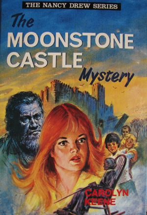
It’s true: Nancy does look disturbingly like Grease‘s Rizzo in a bad wig here. But other than that, the cover has everything you could ask for. Girl detective in a prominent position! Easily identifiable best friends (sporty brunette) George and (plump blonde) Bess! Person who is possibly Carson Drew in a suitably distant position! Looming castle! Man who may or may not actually be a statue! Whistler’s mother!

What more could you need?

Compare that to this 2000 edition of a brand new Nancy Drew adventure, The Mystery in Tornado Alley:

Hmm. I can’t even tell which one of these blonde girls is Nancy. I’ll assume it’s the one in the pink polo neck, but where’s my red-headed girl detective? And if that girl next to her is plump, boy-chasing Bess, I’m going to be more annoyed than I was by the fact that when they re-jigged the Hardy Boys mysteries, the first book showed them investigating the death of faithful long-time girlfriend Iola Martin in a car-bombing.

(For the record, I was quite annoyed about that.)

Actually, the more I look at this, the more questions come to mind:

  • Why is Nancy wearing those hideous high-waisted shorts, at least five years after they were in fashion?
  • Has she realised that if she’s that close to the tornado, she’s probably dead already (in a metaphorical “Achilleus at the end of The Iliad“ way, rather than actual zombie fashion, of course)?
  • Why is she gasping in horror and staring off to her left when the tornado is actually behind her?
  • Shouldn’t the tagline read “Nancy is swept into a tornado of danger”? Because, according to Wikipedia, a tornado is really a specific subset of the broader category that is whirlwind, so I suppose the pun works, but it just seems a little weak. Much like some whirlwinds.

And the publishing gap between reprints doesn’t always have to be broad for the covers to take a sharp dip in quality/amusement value. Take this 1975 edition of the Dana Girls’ Winking Ruby Mystery. (The Dana Girls were an attempt to cash in on the success of Nancy Drew: they were published under the same pseudonym as the Nancy Drew books—Carolyn Keene—and this was their twelfth adventure.)
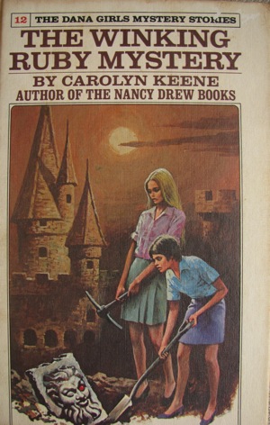
Honestly? I love this cover, around which I constructed the following imaginary conversation:

LOUISE DANA: Heavens! The idol!
JEAN DANA: Louise, why am I holding this . . . well, I don’t know what kind of tool this is, actually.
LOUISE DANA: Its eye! It’s a ruby!
JEAN DANA: Couldn’t I at least have the shovel? At least I know what’s that’s called. Or is that a spade? Should I call that a spade?
LOUISE DANA: But one of the eyes is missing!
JEAN DANA: I mean, anyone can see by comparing my lustrous blonde locks to your pixie cut that I’m not the tomboy in this family.
LOUISE DANA: Someone has been here before us!
JEAN DANA: Fine. Don’t listen to me. I’m just going to stand here and practice my sultry face.

Compare that to this 1981 edition of Mystery of the Stone Tiger:
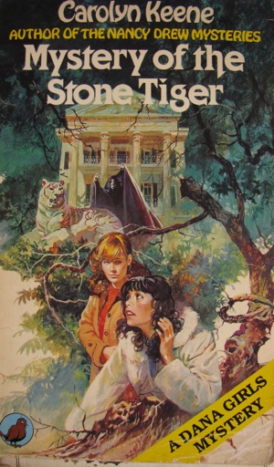
Well, Jean still looks intensely bored. But now Louise’s expression says nothing so much as, “What was that?! Did I just walk through a spider’s web? Is the spider on me? Get it off, get it off, get it off, get it off!”

The vampire in the background is fairly awesome, I suppose. But I remain unconvinced by that overgrown garden—give me the apparently post-apocalyptic setting of The Winking Ruby Mystery any day!

More Cheesy Books (And, No, That's Not An Incorrect Use of Degree)

Posted 22 May 2009 in by Catriona

To celebrate not having any marking to do for the first time since week two, I decided to carry on adding books to my Delicious Library database.

I should, in retrospect, have settled for sleeping on the sofa while pretending to re-read an Agatha Christie novel that I’ve already read, since it took me six hours to catalogue two shelves’ worth of books.

But the upside is that it did remind me of some truly disturbing book covers lurking in there.

In the last post, the books themselves were cheesy. The semi-tragic aspect of these books is that they aren’t all cheesy, but their covers most definitely are.

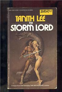
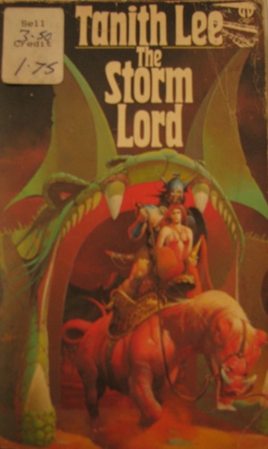
And you don’t get much cheesier than 1970s’ science fiction:

And the terrifying thing I learnt when Googling this book is that this isn’t even the cheesiest cover available. I’m remarkably lucky, I feel, that I don’t have this cover instead:

Except—well, at least in the second one both protagonists are equally naked.

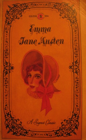
Then there’s one of my disturbingly large number of copies of Jane Austen’s Emma:

I did consider checking whether that bonnet is historically accurate or not, but I’m just not that dedicated. I will venture an entirely uneducated guess that the pink ruff she’s sporting was not a common item of clothing in the Regency period, though.

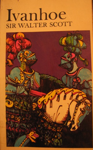
Still, Austen got off lightly compared to Sir Walter Scott:

I’ll be honest: this cover kills me. No one’s going to lost sight of these two on the battlefield! And while I can perhaps see—by squinting and exercising an over-active imagination—that the knight on the left has feathers on his helmet, no amount of squinting will perform the same service for the knight on the right. I’m forced to assume that he topped his helmet with an intricately folded crocheted scarf.

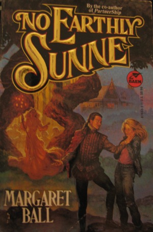
And science fiction isn’t the only genre that suffers from bad covers, of course:

I’m particularly enamoured of the gold text on that one, but let’s have a closer look at the protagonists, shall we?

They seem to be looking at each other longingly, but the more I look at the expression on his face and the position of his torso, the more convinced I become that she’s actually just dislocated his shoulder.

The Cheesiest Books On My Shelves

Posted 21 May 2009 in by Catriona

Well, some of the cheesiest books on my shelves, anyway. (This post brought to you in the wake of the cheesiest television event of the year, the Eurovision song contest.)

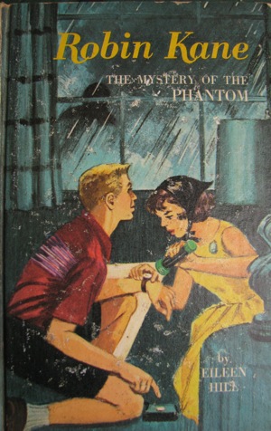
Some of the books are partly cheesy (the headscarf!):

And partly surreal—why is the most significant event in the narrative the moment when Robin checks her friend’s wristwatch by the light of her torch?

And is it just me, or does it look as though that cover’s missing a noun? I always want to ask, “The phantom what, Robin? The phantom what? If this were Nancy Drew, it would be a phantom stagecoach. Or maybe a phantom staircase. Or a clock. But just ‘a phantom’ seems like you’re not trying hard enough, Robin.”

(Imagine how awesome it would be if it were The Mystery of The Phantom: Robin Kane, Girl Detective, versus The Ghost Who Walks.)

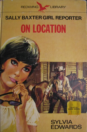
They do get cheesier, though:

Sally Baxter, Girl Reporter, are you on some kind of harness? You seem to be leaning at an extraordinary angle there. Still, if you are on a harness and yet still calm enough to be casually chewing your sunglasses, I do have to admire your sang-froid.

Don’t look now, but I think you’re about to be shot in the back by a cowboy.

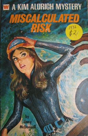
And sometimes they are both cheesy and impossible to interpret:

Kim Aldritch is, and I quote the back of the book here, a “smart, beautiful secretary for an international insurance firm . . . living for the day she can become a full-fledged investigator for the firm . . . action-loving, curious, and courageous.”

And, yes: those are their ellipses. They clearly don’t believe in moderation—or really know what purpose ellipses serve.

What I find intellectually intriguing about these books—this raft of books published right down into the 1970s (this one is from 1972) that deal with working women—is the way in which they construct ambition and professionalism.

What I find amusing about them is the dodgy cover art. Is Kim coming up out of the water there? There does seem to be a boat in the bottom right corner. But then what angle is she on? And how? Why isn’t her hair wet? And why on earth would she apply so much make-up before scuba diving? For that matter, is she scuba diving? She doesn’t have a tank or a snorkel.

So many questions—and only two hundred pages of plot, the first ten of which are taken up by a description of Kim’s trip to work, on the subway, with her father.

Sometimes the books are just out and out cheesy:

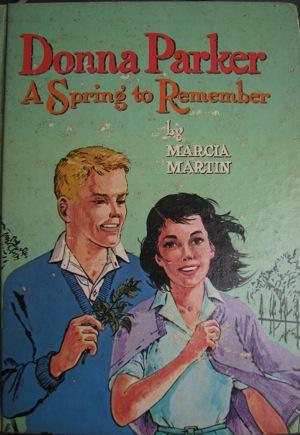
The Donna Parker books are, it seems, popular enough to warrant their own Wikipedia page. I didn’t know that when I bought them, of course. I just liked the picture boards and the strangely freakish faces. (Plus, I have a possibly unhealthy obsession with depictions of female adolescence and female professionalism in young-adult fiction of the early to mid twentieth century.)

And I love his optimism: “Donna, if I give you this twig I just found on the ground, will you be my girlfriend?”

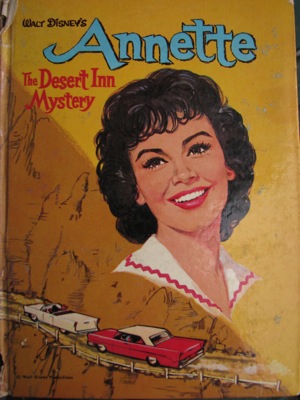
And sometimes the books involve Annette Funicello tail-gating some guy in a convertible:

Enough said, really.

Even World-Famous Seducers Of Women Need To Keep An Eye On Their Public Images

Posted 8 May 2009 in by Catriona

You know, this blog post almost certainly isn’t going to be as interesting as that title suggests. Especially since the man in question is dead.

But yesterday, as I was moving a fabulous but rather disturbing picture of Hansel (as in “Hansel and Gretel”) interrogating two suspected witches (bless you for making that exist, James Jean), I realised that it had been hiding a volume of Casanova’s memoirs (volume four of an 1894 unabridged reprint in six volumes) that I’d forgotten I owned.

[I do own another set of Casanova’s memoirs, from Johns Hopkins University Press (also incomplete: I have only three of the six volumes). I have no intention, however, of posting a picture of their cover. It’s beautiful cover art, but it’s beautiful cover art focusing intently on a naked figure, and this isn’t that kind of blog, despite what the odd Google search suggests.]

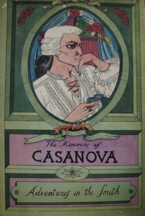
No, it’s the cover of this solitary volume that makes me suspect that Giacomo Girolamo Casanova de Seingalt, had he not inconveniently died in 1798, might be having stern words with his publicist once this arrived on his doorstep:

I’ve slightly distracted myself, now, by wondering just how Casanova might fit into modern society. (He would have a publicist, wouldn’t he? And would probably be just another person famous for nothing more than being wealthy and leisured.) But leaving that aside for the time being, do you think he’d be pleased with this cover?

He doesn’t really look like a man whom—assuming, for the purposes of the argument, that you eye men speculatively—you’d be likely to eye speculatively, does he?

I think it’s the hideously magnified eye.

Well, once we ignore the fact that he appears to be largely two-dimensional, and whatever it is that’s going on with his lips there, and the fact that his cheekbones and chin look like they could cause some serious damage to the bed linen if he rolls over in his sleep—once you move past those issues, I think it’s the hideously magnified eye that’s the most disturbing factor.

I understand that enormous eyes are part of the reason why baby animals are appealing—and I’ve heard the argument (somewhere, many moons ago) that the appealing, exaggerated facial features of young mammals are helpful in triggering the protective instincts of the adult of the species.

But surely that doesn’t apply to Casanova, does it?

Maybe that’s the true secret of his success: perhaps eighteenth-century women were irresistibly attracted to men who looked like bush babies?

It’s one of the great mysteries of my bookshelves.

Categories

Blogroll

Recent comments

Monthly Archive

2012
January
February
March
April
May
June
July
August
September
October
2011
January
February
March
April
May
June
July
August
August
October
November
December
2010
January
February
March
April
May
June
July
August
September
October
October
December
2009
January
February
February
April
May
June
July
August
September
October
November
December
2008
February
March
April
May
June
July
August
September
October
November
December