by Catriona Mills

Articles in “Books”

Illustrating The Naughtiest Girl

Posted 21 April 2009 in by Catriona

Of course, I’ve done this before: no sooner had I started to read L. Frank Baum’s books again, then you were subjected to a series of posts on him and on John R. Neill’s illustrations to the later books. What can I say? This blog is a fickle creature.

But I was thinking at the end of the last post that I really do like the Dean illustrations to Enid Blyton’s Naughtiest Girl series. I have no idea who drew them: no illustrator is listed on either my 1980s’ or my 1990s’ Dean editions. But I do find them beautiful and I was wondering why.

I can’t say this is the only reason why I like them (apart from on aesthetic grounds), but I suspect the main reason is that they concisely capture the idea of Whyteleafe School as a child’s world, where adults are teachers but rarely authority figures—and, indeed, appear remarkably rarely as teachers, since the books concentrate more on the process of socialisation than that of education.

This idea of a child world isn’t unique to Blyton: it reminds me of both Lewis Carroll and L. Frank Baum, where in both cases the child enters a world in which everything—buildings, landscape, other people—is sized to them, so that they can move through it as freely as adults move through this one. (Though this is more true of the novel The Wonderful Wizard of Oz, where the Munchkins are child size, than it is of the film.) And it isn’t unique this these three works among Blyton’s prodigious output: much the same phenomenon is evident in the Faraway Tree books.

But it is unique in my experience among school stories, and these illustrations capture it in detail.

They show a world in which work is the province of children:
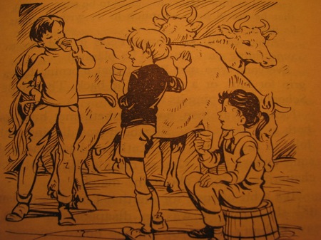
(Even the cows there seem to be on the small side! Jerseys rather than Friesians, perhaps?)

A world where children socialise with one another, independent of adult involvement (and, of course, the fact that this is Blyton’s sole co-educational boarding school helps with that association):
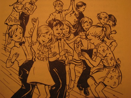
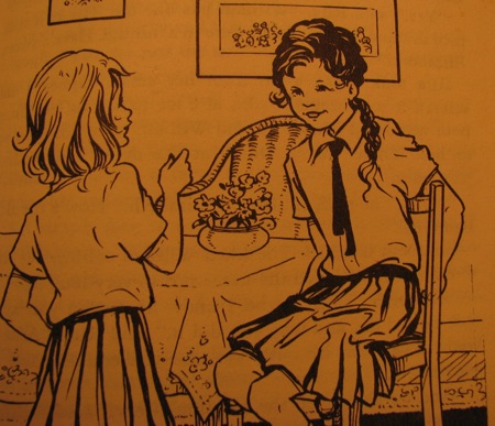
They show a world in which adults rarely appear, even as authority figures. Instead, the authority figures are slightly older children, such as Rita the head girl:
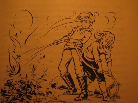
They show a world in which children are deemed competent to deal with disasters (though some children are more competent than others, or Elizabeth would never have lit this fire in John’s absence, and certainly not when the wind was likely to blow it over the woodshed. Perhaps she saw something nasty in there?):
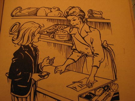
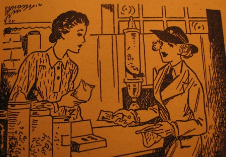
And the idealised child world of these illustrations is more obvious when you compare them with the illustrations of an earlier edition. I have a 1952 Angus and Robertson edition of the final book, The Naughtiest Girl is a Monitor. And the striking thing about this edition is that the children are presented as very much more adult.

This is the more striking in instances where the same scenario occurs across more than one book.

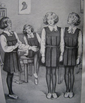
As in the case where Elizabeth shops for her ill-thought-out surprise birthday for Joan in The Naughtiest Girl At School:
Compared to the spoilt Arabella refusing to pool her money and buying expensive chocolates in The Naughtiest Girl Is A Monitor:
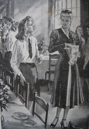
Or Elizabeth being greeted at the railway station by friends in The Naughtiest Girl Again (and, once again, note the absence of adults):
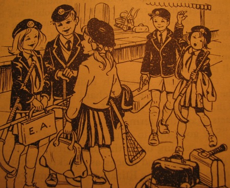
Versus the same scene at the beginning of The Naughtiest Girl Is A Monitor:
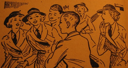
Call me old-fashioned, but I much prefer the child protagonists of the Dean illustrations to the oddly ageless ones that Angus and Robertson commissioned for the 1950s.

The 1970s Don't Have A Monopoly On Ugly Covers For Girls' School Stories

Posted 20 April 2009 in by Catriona

In the earlier post on ugly 1970s’ book covers for girls’ school stories, we got to talking about ugly 1980s’ and 1990s’ covers.

And I thought, “Wait, I have some of those!” And so here they are.

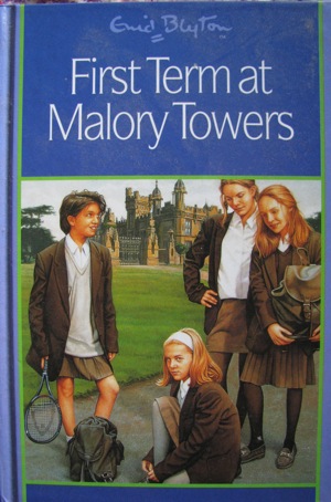
Actually, this one isn’t ugly, as such:

But can you imagine the teachers at Malory Towers putting up with such sloppiness? Particularly the hair: I remember distinctly that in this actual book, Gwendoline has her hair tied into pigtails by Matron because it ends up falling around her ears—much like the hair of that girl second from the right.

Plus, I really don’t see the point of updating the covers when the story inside is still so intensely 1940s.

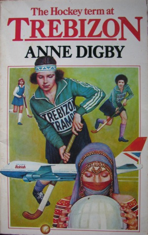
But with this next one, the cover is very much of its time. The book was published in 1984:

And, wow, but that’s one 1980s’ cover. The sweatband! The random aeroplane (with speed lines)! The purple kneesocks! And what I love most about this is the fact that their hockey team is called the Trebizon Tramps. It may have been a simpler time, but that’s not actually that recent a slang term.

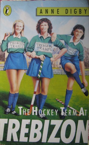
I have a later version of this book, too, from 1988:

I don’t know which is worse, but I do know there’s something seriously wrong with the thighs on that girl on the left. And I love the fact that the girls have all been rendered practically indistinguishable, despite the fact that they’re different nationalities.

ME: Honey, guess the nationality of these girls.
NICK: Eastern European.
ME: Really?
NICK: No. I can’t tell!
ME: The one on the right is Afro-Caribbean.
NICK: Wow.

That about sums it up.

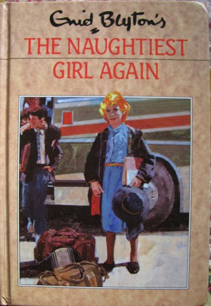
But this one from 1995, is by far the ugliest of all:

I mean, that is just hideous, isn’t it? I see no redeeming characteristics at all—and I think that boy on the left has just had his neck snapped by the kid behind him. This is The Naughtiest Girl Again with vampires. (Yes, I associate neck-snapping exclusively with vampires. Blame Buffy.)

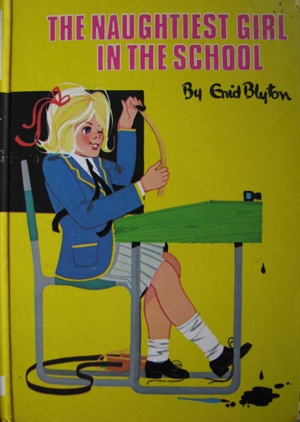
And it’s a shame, really, because it’s a Dean edition, and the Dean editions from the mid-1980s, when I first read them, were actually rather cute:

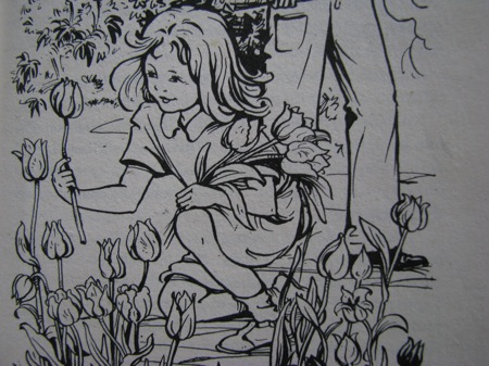
Plus, this terribly ugly one still has the original (Dean) illustrations, and I’ve always thought the line drawings for the Naughtiest Girl series were beautiful:

Certainly more beautiful than that revolting cover.

Belated Conclusion To The Weirdness Of Girls' School Stories

Posted 16 April 2009 in by Catriona

While my parents were visiting, we popped out to a bookshop I rarely have a chance to visit, and I found a lovely little pile of Angela Brazil and Josephine M. Brent-Dyer school stories.

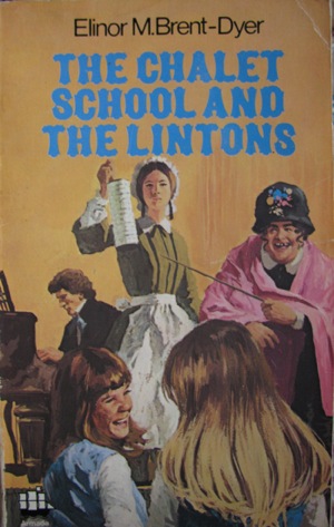
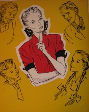
Including one that has the worst cover I have ever seen:

Shudder.

The mustard yellow! The hideously magnified laughing schoolgirls! The—actually, what is that font? Some sort of pseudo-Swiss 1970s’ thing?

And why is there what appears to be a waxwork model of one of the pilgrims who headed to the New World seeking a country in which they could worship in their own way and stop other people from worshipping in theirs? And why is she holding a rain gauge?

And is that Beethoven in the background?

I’m not even going into what’s happening over on the right-hand side of the cover, there.

I do think I’m going to have nightmares, though.

The Weirdness of Girls' School Stories: Part Two

Posted 12 April 2009 in by Catriona

And still continuing Random Weirdness from Girls’ School Stories weekend on the Circulating Library.

(Don’t worry: I have no intention of running through all 132 books. Well, maybe. No, probably not.)

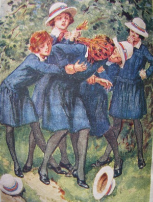
This frontispiece from Ierne (yes, Ierne) L. Plunket’s The Dare Club neatly encapsulates the difficulties of being a teenage girl struggling through adolescence in an all-female, highly regimented environment:

In other words, at any moment your peers might knock your hat off and attempt to suffocate you with a garishly patterned silk scarf. You can’t say you haven’t been warned.

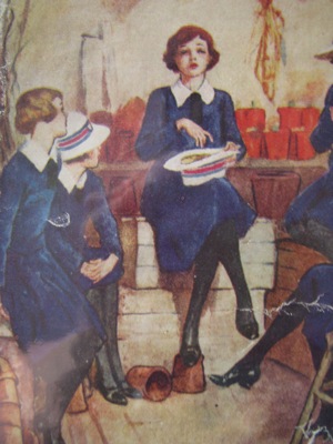
And, in fact, The Dare Club, as one of the weirdest books on my shelf, gets a second mention in this series. This illustration is from the cover:

I’m going to do the illustrator the favour of assuming that this is some sort of lottery, but it looks as though the girl’s going into a trance over that hat. Perhaps they misplaced the ouija board, and are practicing a rough-and-ready form of divination with Scrabble tiles?

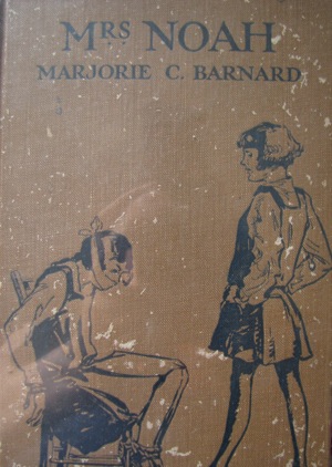
I have no idea what’s happening on the cover of Mrs Noah here:

Given that a cursory glance at my shelves reveals an improbably high number of illustrations showing schoolgirls being tied up by their peers, I’m increasing glad that I wasn’t a boarder at my semi-boarding school.

This one’s the frontispiece from W. E. Eastways’s Christine of the Fourth:

The actual caption is “‘You think you have the right to run everyone’s lives,’ flashed Christine.” But given that Christine’s expression is one of mild bewilderment rather than anger, I suspect a better caption would be, “Um, madam? I think your wedding might be in the other hall.”

And this frontispiece from Marjorie Taylor’s The Highland School is even more bewildering:

The caption reads “‘Never mind about that just now. I want to talk to you two,’ said Janet curtly.”

But every time I look at it, I’m visited by the overwhelming impulse to shout, “No capes!”

The Weirdness of Girls' School Stories: Part One

Posted 11 April 2009 in by Catriona

Continuing the Random Weirdness from Girls’ School Stories weekend on the Circulating Library.

These ones aren’t even mildly suggestive, like the last set. They’re just out-and-out odd, which is, frankly, how I like my school stories.

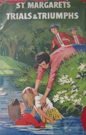
This one’s from St Margaret’s Trials and Triumphs, the last in Helen S. Humphries’s mildly religious school series.

Well, I say “mildly religious,” but the first book, Margaret the Rebel, is advertised on the back of this one with the following blurb:

Margaret Vincent had been the spoiled darling of her widowed mother. Consequently, when her mother marries again Margaret is furious and hates everything connected with her stepfather. At school Margaret is against everyone, but, fortunately, she has an understanding headmistress and form-mistress, and through them she is led to the Savior.

So “mildly” might have been understating it. They’re less religious than the Glendorran series, though, in which Wendy copes with a school whose inhabitants are such heathens that they smoke out of the dormitory windows. And no, I’m not joking about that.

So, St Margaret’s Trials and Triumphs:

Doesn’t seem that weird, you say? What I love is that the girl didn’t bother to remove her blazer before she leapt into the pond. Sure, a small child’s life was in danger, but, honestly, where’s the pride in the uniform? When Elizabeth did the same thing in The Naughtiest Girl Is A Monitor, she took off her blazer and her shoes and stockings, which is how the child’s wealthy father didn’t know who the rescuer was.

And, yes, I can just recite plot points from Enid Blyton novels off the top of my head. It’s a gift.

Methinks the St Margaret’s girl here wants some school branding prominently visible in the inevitable newspaper photographs.

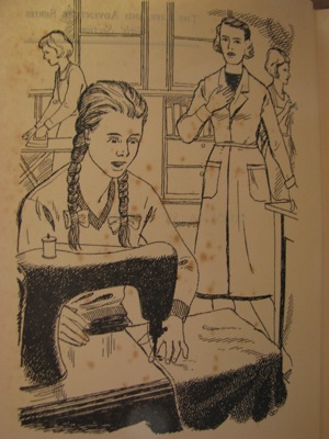
Of course, it’s less disturbing than this illustration from Susan Ann Rice’s Form 2A At Larkhill:

Yes, she has stitched her finger to whatever garment she’s making in Home Economics. And, yes, this is the frontispiece to the book—of all the available scenes, the editors thought this was the one that best illustrated the book.

I’m assuming it takes place in chapter three, “Excitement in the Needlework Room,” but it gives me a poor impression of Larkhill in general and its Home Economics teachers in particular.

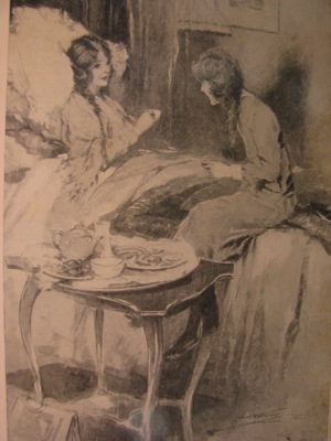
Pamela Hinkson’s Patsey At School is a different case altogether:

This is a school story, it’s just a school story masquerading as an early Edwardian melodrama. This could be easily captioned “Dead, and never called me mother!” or “Freedom I can promise myself, for who can chain or imprison the soul?”

The fact that it’s actually captioned “It was awfully wicked of you to do it, of course” doesn’t really clear up the confusion.

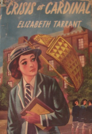
And I have absolutely no idea what’s happening in the cover to Elizabeth Tarrant’s Crisis At Cardinal:

I presume the crisis is that the students are being menaced by grotesquely oversized jewelry that when you look at it closely appears to be looking back at you.

It doesn’t help that, while I think the girl is looking back at the trio of girls on the right-hand side of the cover, it looks as though she’s thinking, “Damn! Is that brooch still following me?”

Slightly Suggestive Illustrations From Girls' School Stories

Posted 10 April 2009 in by Catriona

Nick very kindly bought me (or perhaps was given free, after spending much money on other applications: I’m not sure which) a copy of Delicious Library 2, an application that technically allows me to add all my books to an electronic database by holding them up to the Mac’s camera, which scans their barcode, checks the details on Amazon.com, and uploads a little bibliographic record and picture of the cover.

Cool, huh?

Of course, in practice it’s not that simple. Many, many of my books don’t have barcodes, so I need to perform a manual search for them. Many of my books aren’t on Amazon.com, especially the older copies of my Victorian novels. Also, barcodes are apparently recycled after a certain time, which explains why my 1970s’ edition of Diana Wynne Jones’s Archer’s Goon was uploaded as The UFO Report by Tim Moore. And, of course, it’s an an enormous amount of effort adding my existing library to the database.

It’s worth it, though—and it will be easy enough to add each new book as I buy it, to keep the database up to date. It also allows me to store books in sub-groups as well as in a main database of all my books, so I can see all my detective fiction or all my children’s fantasy at a glance.

So I spent an enjoyable couple of hours in the spare room this afternoon, adding 132 girls’ school stories to the database.

I didn’t know before that I owned 132 girls’ school stories. It does seem rather an excessive number, I admit—but they’re so hilarious! So, in honour of Delicious Library, this Easter long weekend is Random Weirdness From Girls’ School Stories weekend on the Circulating Library, starting with illustrations that are slightly suggestive.

This one’s from Mary Alice Faid’s Trudy Takes Charge:

I don’t know what Trudy’s pondering there, but at least she seems to be keeping her options open.

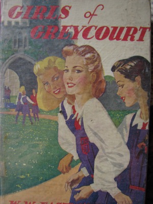
W. W. Eastways’s The Girls of Greycourt is slightly more ambiguous:

By which I mean I can’t figure out whether those girls are intimately involved with one another or are trying to seduce the reader.

Probably a combination of the two. Which is all well and good, since they seem on a cursory glance to be at least thirty-five, and therefore well over the age of consent.

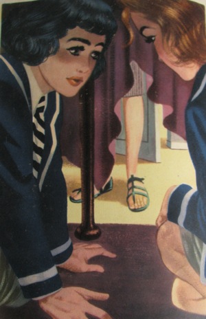
This last one is from Elizabeth Tarrant’s Crisis at Cardinal, the cover of which is going to make an appearance in a later installment:

I love the air of intense concentration from the girl on the left. And the fact that the original caption reads “Within a couple of seconds they were both under the table” only increases my joy.

I shudder to think what the reaction of the mistress in the fetching sandals will be, though.

Categories

Blogroll

Recent comments

Monthly Archive

2012
January
February
March
April
May
June
July
August
September
October
2011
January
February
March
April
May
June
July
August
August
October
November
December
2010
January
February
March
April
May
June
July
August
September
October
October
December
2009
January
February
February
April
May
June
July
August
September
October
November
December
2008
February
March
April
May
June
July
August
September
October
November
December