Judging A Book By Its Cover
Posted 27 June 2008 in Books by Catriona
It never fails: I no sooner actually write a post about how I have nothing to post about than I think of fifteen different possibilities for entries.
In this case, though, I was sitting this afternoon desultorily flipping through the rats’ packs in Packrat—hoping a raincloud would pop up for me, but it never did—when I kept focusing on Judging A Book By Its Cover, a collection of essays edited by Nicole Matthews and Nickianne Moody that I recently reviewed for M/C Reviews.
I’m fascinated by reader-response work—though frequently horribly frustrated by it, as well—and it formed a key element of my thesis.
I’m also fascinated by the marketing of fiction, though not quite in the same way as the essays covered in Judging A Book By Its Cover, which focuses largely on twentieth-century publications: my nineteenth-century interests have more to do with advertising and networks of authorship than with graphic design.
But the book did make me realise that I have some books with truly hideous covers on my shelves.
(Of course, I also have a wide number of books with gorgeous covers; I may do a companion post once I’ve finished this one.)
These aren’t the worst, but they’re all fairly awful.
Of course, picking a 1970s reprint of an Agatha Christie novel is rather like shooting fish in a barrel; they’re all dreadful, really.
But this is one of the worst:
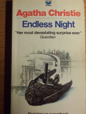
That poor owl.
I haven’t actually read this novel, I’m ashamed to admit (I only picked it up in May this year, judging by my inscription) so I have no idea whether a brutally murdered owl is central to the plot, but it’s certainly not something you want to look at on your bedside table as you’re dropping off to sleep.
Of course, I picked Endless Night over two others, which I think have much more revolting covers: Lord Edgeware Dies shows the back of a man’s head with a knife sticking out of the nape of his neck, while By The Pricking Of My Thumbs gives prime position to the broken, dirty head of a porcelain doll.
(That latter instance may not freak out other people as it does me, but creepy dolls are right up there with clowns in the terror factor, as far as I’m concerned.)
Either way, neither of them were images that I wanted on the blog.
If 1970s’ Agatha Christies are too easy a target, so are 1980s’ Rex Stouts. At least Endless Night probably never stood a chance. The image above is from a 1971 reprint, but the novel itself was published in 1967, and would almost certainly have always had a hideous cover.
But this cover of Some Buried Caesar is a 1982 reprint of one of the earliest Nero Wolfe mysteries, from 1938:
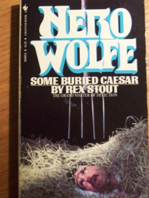
By all rights, this should have some lovely, elegant typography and minimalist artwork. Instead, we have a grimacing man about to be speared by a pitchfork (if it helps, he’s already dead. Spoiler!) and a fairly ugly font.
It doesn’t really seem fair, for one of the funniest and cleverest of the Wolfe mysteries.
But then, I revere Stout, so perhaps I’m taking up the cudgels on his behalf a little too readily.
But then, I also revere Sayers, and I’ve included this in the list:
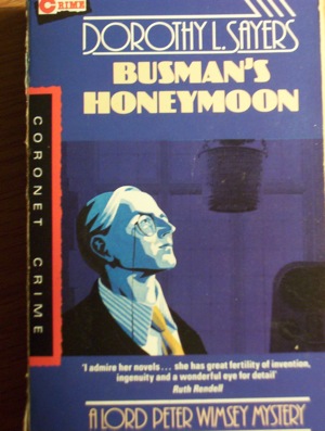
This, like Stout, is a 1980s’ reprint of a 1930s’ novel: in this case, the 1988 edition of 1937’s Busman’s Honeymoon. They’re dreadful editions—the type of paperbacks where the glue shatters after a decade, so every time you read it subsequently there’s a constant gentle rain of yellowish fragments into your lap.
Really, it doesn’t look as bad as the preceding examples. The font is rather pretty and period appropriate, and I rather like the portrait of Wimsey, although I suspect it flatters him.
But it gives away vital information.
Sayers’s (or rather, Wimsey’s) technique comes down to this: when you know how, you know who. This cover, then, gives away the murderer, if you read it the right way. And that always irritates me. (My copy of Ngaio Marsh’s Grave Mistake does the same: it’s as though they were designed by people who went on to write programme promos for Channel 7. But then Marsh’s title is a dead giveaway, as well.)
Still on the crime theme, how about a late edition Trixie Belden? This one’s from 1984: there’s no evidence that it’s a reprint and it’s a late title in the series, so it looks as though someone deliberately marketed a new title with this cover.
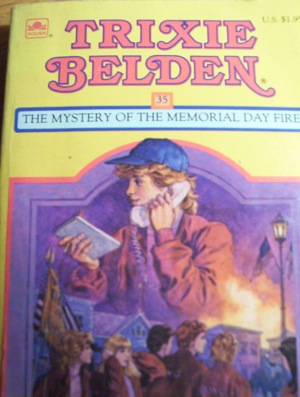
I mentioned in my second post on Tunnels the widely popular belief that boys won’t read books with girl protagonists—I wonder if that’s behind the androgynous image of Trixie in the middle of the cover.
I mean, I know she’s a tomboy, but honestly. She looks like Jimmy Olsen.
She’s more feminine in the bottom picture, assuming that’s her in the bottom-left corner next to Honey Wheeler.
Still, I’ve saved the best for last. This, I suspect, is the worst cover on my entire bookshelf:
This is a reprint—undated, alas—in the Abbey Rewards series, a series of reprinted novels sharply divided on gender lines: the list of “Girls’ Fiction” on the back includes Rosamund Takes The Lead, Sidney Seeks Her Fortune, and Polly of Primrose Hill, while “Boys’ Fiction” encourages them to read Adrift in the Stratosphere, Wreckers’ Bay, and Berenger’s Toughest Case.
The book itself is an inoffensive if unoriginal school story, but the cover is nightmarish.
No—I’ve unwittingly told a lie.
What Katy Did Next (1886) is the third of Susan Coolidge’s five novels about the Carr children and their lives in New England in the 1860s.
What Katy Did Next, actually, shows Katy travelling to Europe and meeting a handsome naval lieutenant with whom she could live happily ever after.
Some time in the distant past, I bought a copy of What Katy Did Next from this Abbey Rewards series.
If I hadn’t subsequently removed it from the house on the grounds that the enormous eyes and hideously disproportionate heads scared me witless, that would certainly have been the gem of this list.
Share your thoughts [9]
1
Tim wrote at Jun 27, 11:13 am
I remember quite a few rather gruesome Christie covers, possibly from the same set of editions. But I don’t quite agree that the Sayers cover is a giveaway — it simply depicts an element that is known to be present at the scene.
2
Catriona wrote at Jun 27, 11:57 am
I think most of the Christie covers were awful—even the rather nice editions they brought out in the late 1980s tended to have hideous pictures. I think my favourite of the ones I have is Death in the Clouds—one mine, the wasp is clearly made out of papier mache. It’s not grotesque, but it does have a “What? Why?” factor that I like.
The Sayers cover isn’t as overt as the Marsh cover that I mentioned, but it is more than just an element present at the scene, I think. At the risk of sounding facetious, it’s two elements present at the scene, the significance of which is by no means emphasised until about two pages before the murderer is unveiled. Having them on the front cover risks drawing the reader’s attention to them more overtly than the prose might invite. I think Wimsey’s gaze is also suggestive.
3
Tim wrote at Jun 27, 12:23 pm
Speaking of Death in the Clouds, I had the same edition as that shown in The Unicorn and the Wasp.
I interpreted Wimsey as gazing offscreen, as it were, partly because he’s drawn in a different style. But I see what you mean.
4
Catriona wrote at Jun 28, 01:25 pm
Actually, I’ve just thought of another point re. Busman’s Honeymoon—the scene of the death isn’t actually isolated until the very end of the novel: during the parlour scene, in fact. Prior to that, there’s all this upstairs-downstairs-in my lady’s chamber debate about where the death actually took place.
So this cover gives away more than I originally thought.
5
Tim wrote at Jun 28, 03:58 pm
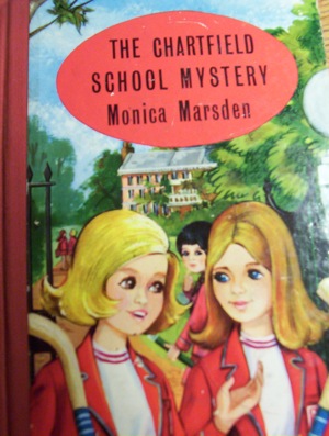
It’s only obvious once you’ve read the book, though. I maintain that the cover can be viewed as simply showing the lead character present in a particular setting. Just as The Chartfield School Mystery presumably has a scene in which two girls talk on a path outside the school gates.
I’d even say that the murder method in Busman’s Honeymoon is so implausible that the details on the cover aren’t going to give it away to any except the most ingenious of readers.
6
Catriona wrote at Jun 28, 11:52 pm
I’ll agree with the last point; it is, perhaps, the most implausible of her murders. I suppose by saying that it gives the murder away, I’m exaggerating. But I maintain that if the reader pays attention to the cover—as with the Ngaio Marsh book I mentioned—it draws their attention to a scenario early in the narrative, which in turn might make them unduly suspicious before the author is inviting suspicion.
In fact, the more implausible the murder method, the less inclined you should be to put it on the cover of the book.
(And I wouldn’t bet on The Chartfield School Mystery containing that scene; they’re designed to be decoded in a slightly different way. You can spot a girls’ school story a mile away, even if they don’t have “School” in the title: they rely on a combination of blazers, hockey or lacrosse sticks, and big Victorian/Edwardian buildings to attract genre readers, but they don’t necessarily combine any of these in a scene from the book.)
7
Tim wrote at Jun 29, 08:32 am
Blazers, etc. are nonetheless in the book, I’m guessing.
8
Leigh wrote at Jun 29, 10:02 am
My love of different covers is why I have 6 copies of Day of the Triffids, so many covers and so little shelf space xx
9
Catriona wrote at Jun 29, 09:55 pm
Oh yes, blazers are in the book. And hockey sticks, too. But with most girls’ school stories, the covers may as well show a jumbled pile of these items, so little relationship is there between the cover image and the text.
That’s not a problem, of course; just a different way of encoding the material to attract readers. I have a feeling I should be able to think of another example—another genre—that worked in this way, but I can’t.
It’s on the tip of my tongue, though.